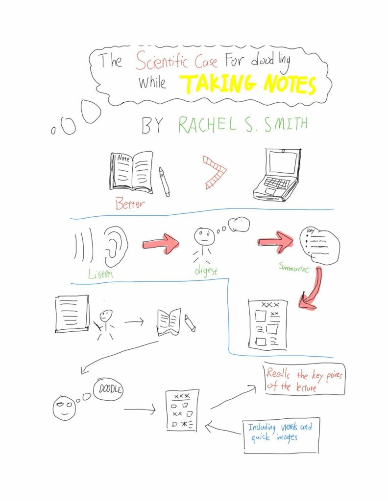
The sketching process provides space for constructing meaning and providing better memory. They can certainly help me review the details in meetings, lectures, and even conversations. However, the sketchnoting process still has some limitations. When you understand some abstract knowledge (such as some philosophical theories), it will be difficult to use sketchnoting to help you remember the key points of the knowledge.
The first multimedia principle used in the sketching is signaling principle. In the sketchnoting, it not only encourages users to use different colors to highlight the key points of knowledge but also encourages users to use images instead of words to summarize knowledge points. Through the use of colors and pictures, the audience can more easily find the main points of the sketchnoting content.
And the second multimedia principle would be the redundancy principle. In the sketchnoting, users only need to use some keywords and simple pictures to summarize the main points of an article or video. Therefore, users do not need to use too many words to explain the knowledge points of the article like traditional notes.
The last multimedia principle would be the split-attention principle. In the sketchnoting, the text and the picture are closely connected. The audience often understands the key points through the text in the sketch annotations, and the pictures can make the audience better connect with the knowledge points.

Leave a Reply
You must be logged in to post a comment.