Welcome

Author: xiaominzhu (Page 1 of 2)

A4 How To Protect Yourself During An Earthquake Blog Post

The link of the lesson plan: https://docs.google.com/document/d/1eZKKtDm_bTUu8PkewLcD-v9ukPLvaQT0muGN7Jp2Gw0/edit?usp=sharing

The link of the PowerPoint Presentation: https://docs.google.com/presentation/d/1WANYlAqQKJ8fx9gacvWxks5cFyAQoS-SI6qmX1BJK44/edit?usp=sharing

The H5P video:

In this assignment, we apply several multimedia principles in our video and powerpoint presentation.

  • Multimedia Principle: I used pictures and text together instead of plain text to make my audience understand better. For example, we have three keywords (Drop, Cover and Hold) in our third slide, In order for the audience to understand the meaning of these three keywords more intuitively, we placed the picture related to the keywords in the lower right corner of the slide.
  • Coherence Principle: In the slides, we just simply added some key points and graphs which are related to the topic. We tried to reduce redundant content and left only important and necessary information to our audience.
  • Signaling Principle: In some key points of our slide, we highlighted some words. This will help audience focus on important information.
  • Spatial Contiguity Principle: In the slide, we kept our key points and pictures close together. Audience can easily relate text to graphics, and this makes it easier for learners to process information and use less energy to explain meaning.
  • Embodiment Principle: In our presentation, our pictures did not show in the video so that we won’t distract our audience’s attention.

Assignment3B Update My Twine Story

I updated the Twine story by adding a new multimedia principle and some Youtube videos. In a previous blog post, I introduced three multimedia principles related to the Twine story, and they are principles of segmenting, contiguity and signaling. The signaling principle is the idea that people can pay attention to the highlighted key information and make decisions based on that information. Through the principle of contiguity, the audience can imagine the end of the characters in the story based on pictures and words. And the principle of segmenting divides the story into several different parts and the audience can browse different parts of the story according to their own ideas. After reading the multimedia principles website again, I really think I should add the coherence principle to the Twine story.

The idea behind the principle of coherence is to use only simple text and images related to the story. So in my Twine story, I added short texts and pictures to describe the situation and surroundings the protagonist is facing, so that people can choose according to their ideas at the time. I hope I can tell the most concise story of words and pictures through the Twine.

(New Twine story ending)

In addition, I added some YouTube videos at the end of the Twine story so that people can visualize the end of the story more intuitively based on the video.

Assign2B Feedback Blog

  1. Ashlyn MacKenzie 

Blog link: https://ashlyn-mackenzie.opened.ca/2021/03/11/blog-7-life-by-powerpoint/ 

  • She highlighted the relevant multimedia principles and did some short explanations about those principles.
  • She posted a video related to the PowerPoint presentation in her blog.
  • I wonder if she can use some multiple-choice questions in the video to make it more interactive.
  • I wonder if she can add some personal experience related to the lesson plan in her Blog.

2. Paige Krivoshein 

Blog link: https://oatmilklatte17.opened.ca/analyzing-a-ted-talk/ 

  • She explained the multimedia principles and theories related to the Ted Talk video.
  • She listed the relevant video and resources in her blog post
  • I wonder if she can add some personal experience related to the lesson plan in her Blog.
  • I wonder if she can list the multimedia principles and theories used in the video separately instead of putting them together.

3. Reggie Jin

Blog link: https://reggiejin.opened.ca/2021/03/21/blog-9-bad-news-sketchnote/ 

  • He listed the relevant multimedia principles and Active Learning Methods in his blog post.
  • He added his sketch note into the blog post
  • I wonder if he can explain the multimedia principles related to the topic.
  • I wonder if he can add some personal experience related to the lesson plan in his Blog.

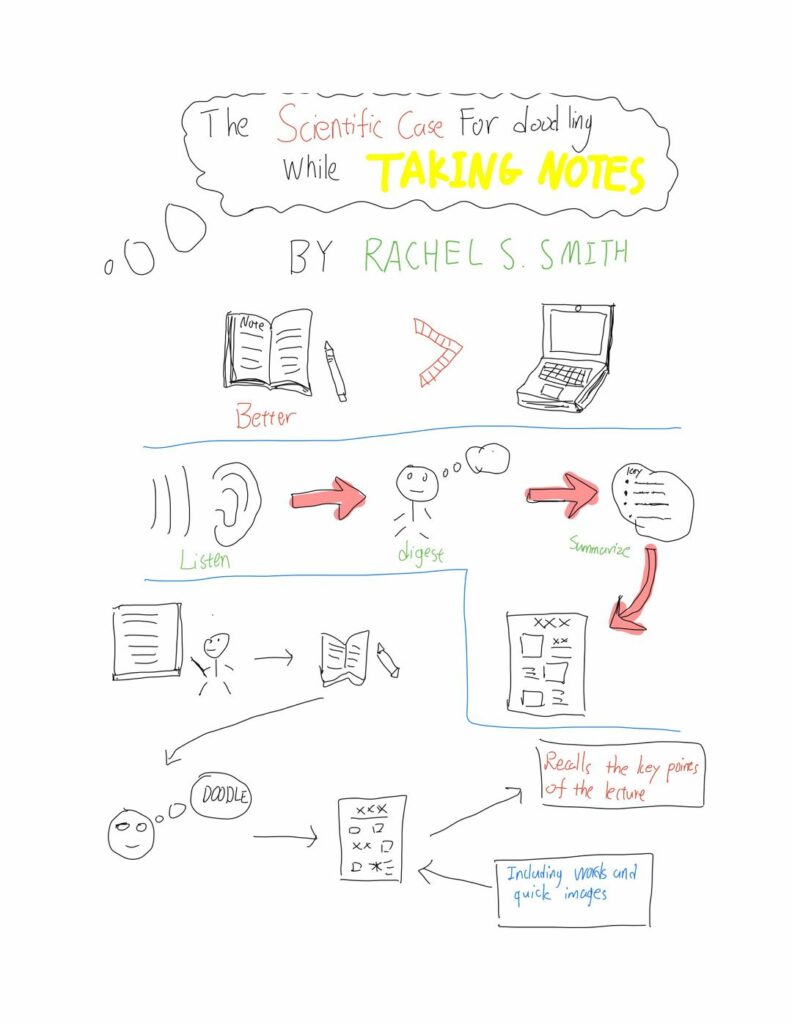
Week9 Sketchnoting Blog

The sketching process provides space for constructing meaning and providing better memory. They can certainly help me review the details in meetings, lectures, and even conversations. However, the sketchnoting process still has some limitations. When you understand some abstract knowledge (such as some philosophical theories), it will be difficult to use sketchnoting to help you remember the key points of the knowledge.

The first multimedia principle used in the sketching is signaling principle. In the sketchnoting, it not only encourages users to use different colors to highlight the key points of knowledge but also encourages users to use images instead of words to summarize knowledge points. Through the use of colors and pictures, the audience can more easily find the main points of the sketchnoting content.

And the second multimedia principle would be the redundancy principle. In the sketchnoting, users only need to use some keywords and simple pictures to summarize the main points of an article or video. Therefore, users do not need to use too many words to explain the knowledge points of the article like traditional notes.

The last multimedia principle would be the split-attention principle. In the sketchnoting, the text and the picture are closely connected. The audience often understands the key points through the text in the sketch annotations, and the pictures can make the audience better connect with the knowledge points.

(Sketchnoting for “The scientific case for doodling while taking notes”)

Ted Talks Week8 Blog

Topic: How to Get Your Brain to Focus | Chris Bailey | TEDxManchester

In this video, I found that the speaker’s slides not only use cognitive load theory but also use some multimedia principles.

The speaker uses cognitive load theory to enable the audience to quickly understand the topic of the speech, which can make the audience better focus on the speaker. For example, his slides are basically only a few keywords or a short sentence.

The first multimedia principle used in this video is that the coherence principle. When the speaker talked about people thinking of many brilliant ideas in the bath, a picture of the bathroom also appeared on the slide. Although there is only one picture in this slide, this picture plus the speaker’s description makes me immersive.

The signaling principle is the second multimedia principle he used in the video. This speaker is very good at using the contrast of font size and bright colors to grab the audience’s attention. For example, in one of the slides, he used a black background and white fonts to highlight the idea of his speech, and he made the number in the sentence more conspicuous so that the audience was immediately attracted by that number.

The last multimedia principle used in the video is the contiguity principle. Whenever the speaker talks about a different point of view, the slides will be changed at the same time. The text and pictures in the slides are also related to the content of the speaker’s speech.

Storytelling week7 Blog

Link of my Twine story: https://studentweb.uvic.ca/~xiaominzhu/Fire_story.html


There are three different multimedia principles used in my Twine story, and they are principles of segmenting, contiguity and signaling.

The first multimedia principle I used in my Twine story is signaling. The purpose of the signaling principle is to highlight the key information that should be noted. In my Twine story, I emphasized the key information of the story and the ending of the story, so that the audience can not only make choices based on the key information at once but also see the results of their choices.

And the second multimedia principle is the contiguity principle. In my story, I added some pictures to certain endings. The audience can imagine the ending of the characters in the story based on the pictures.

The last multimedia principle used in the Twine story is the segmenting principle. The principle of segmenting divides the story into several different parts and the audience can browse different parts of the story according to their own ideas. In the Twine story, Viewers can click the button on the upper left to return to the previous page or go to the previous page.

I think the Twine story can be used to teach children how to protect themselves in an earthquake. When a Twine story earthquake occurs, we let the children choose different options, and the Twine story will tell them the consequences according to their choices. Through TS, children will be more impressed by the behaviors that can protect themselves from earthquakes.


Improve Google Earth Story

For this assignment, I improved my Google Earth project by implementing some multimedia principles.

First I used the principle of coherence in the project. Because I know that viewers can more intuitively understand the appearance and function of each marked position through pictures, I deliberately selected some pictures related to the appearance and function of the marked position and put them into my project. After the viewer clicks on the icon, they can quickly understand the information of the marked place through pictures and a short introduction.

Secondly, I used the signaling principle, and in the description of each marked location, I highlighted the keywords. Through the comparison of fonts and colors, the audience can quickly and accurately grasp the main points of the description.

The third principle I applied to the solution is the principle of redundancy.  In this project, I added some pictures related to the marked locations so that the audience can understand the appearance and functions of the marked locations through the pictures. In order for the audience to have a more comprehensive understanding of the marked locations, I briefly summarized the function and meaning of each marked location.

The last principle I used in this project is the principle of spatial continuity. Sometimes these icons may be so close that the viewer will click other icons by mistake. Therefore, I adjusted the position of each icon so that each icon can more accurately represent a different destination.

In the end, the principles I applied to the project not only made my project more organized but also made it easier for the audience to understand the main points of the project.

The link of my Google Earth project: https://earth.google.com/earth/d/1l78Ah0bxHBBEQ7pyyr8zBuWeDuEKMiX8?usp=sharing

Feedback1 Blog (Ashlyn MacKenzie Blog)

  • She did a great job of explaining why lesson plans are important for teachers and creators.
  • She added a comment and some single-choice questions in her H5P video.
  • I wonder if she can use some multiple-choice questions in the H5P video to make it more interactive.
  • I wonder if she can add some personal experience related to the lesson plan in her Blog.
  • Link of Ashlyn Blog post: https://ashlyn-mackenzie.opened.ca/2021/02/06/blog-4-organization-and-advanced-searching/
« Older posts

© 2024 EDCI 337

Theme by Anders NorenUp ↑